Reduce onboarding flow's build time by 50%
Overview
Background
Upflowy's mission is to empower marketing experts to effortlessly create onboarding flows without the need for engineering support. One significant challenge we identified was the usability of our drag-n-drop interface. Users reported difficulties in seamlessly building and customising onboarding flows, hindering the efficiency and user satisfaction of the platform.
Pain Points
Users reported difficulties in seamlessly building and customising onboarding flows, hindering the efficiency and user satisfaction of the platform.
- Complexity: users found the list of components overwhelming and time-consuming searching for the right one to use
- Visual clutter: Smaller screens exacerbated spacing issues, resulting in a visually cluttered interface.
Objectives
Improve drag-n-drop interface usability
Outcome
- Reduced average flow creation time by 25%
- Increased user satisfaction score from 3.6 to 4/5
- 30% increase in advanced customization feature adoption
My Role
I was the lead designer, collaborated with PM and developers in a fully remote settings.
My Process
1. Research: Card sorting exercise to categorise components
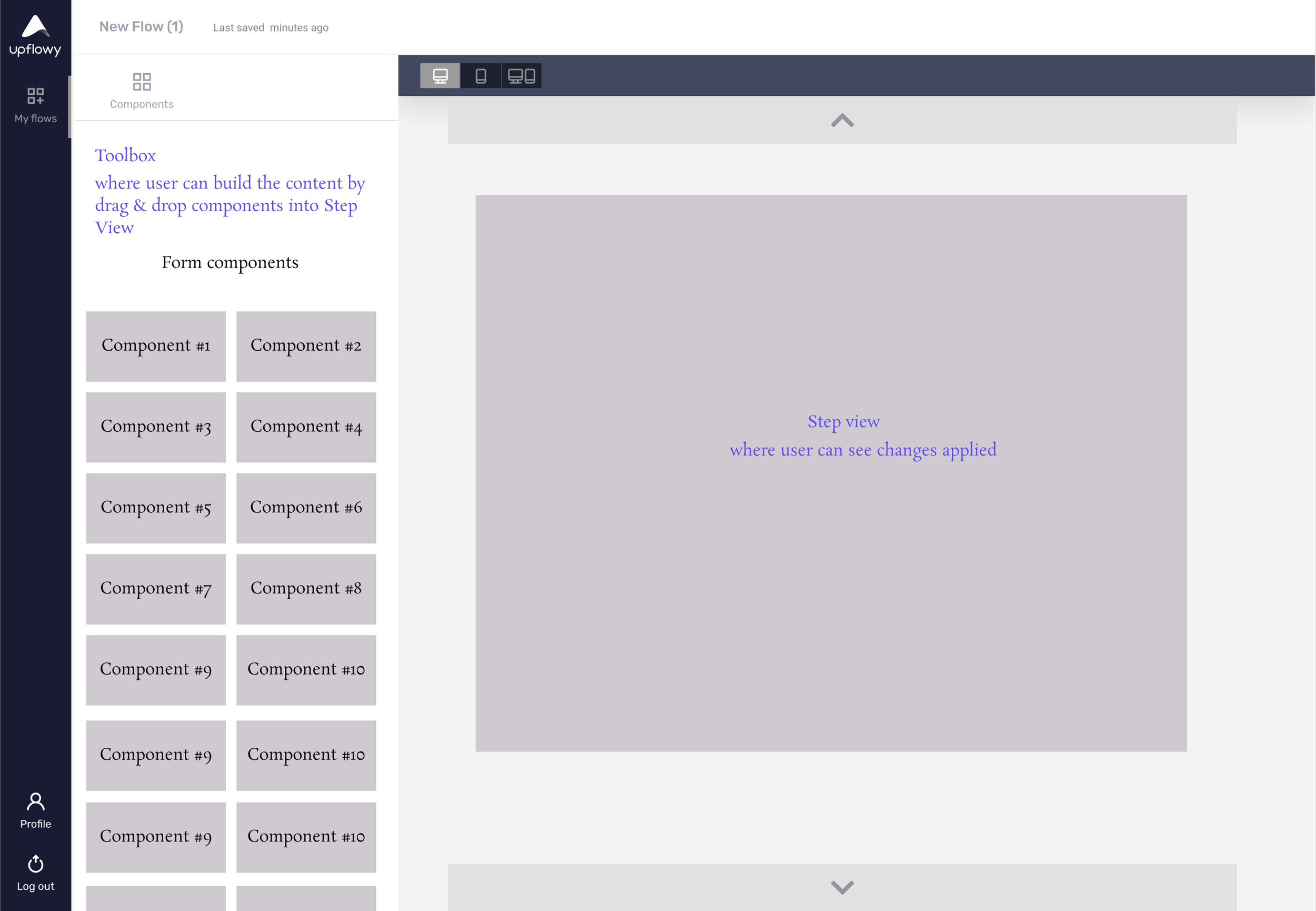
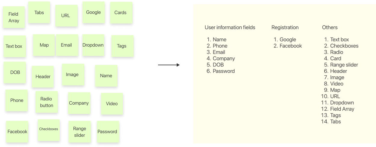
There are a number of components available for users to utilise when building an onboarding flow (i.e Input, Email, Phone, Checklist, etc.), which can make the workspace appears overwhelming if not carefully organised and displayed. One of the best approaches is to categorise and group the components of the same family.
So how should the components be grouped? To answer this question, I decided to arrange a quick open card sorting exercise for team members.
Key Design Approach
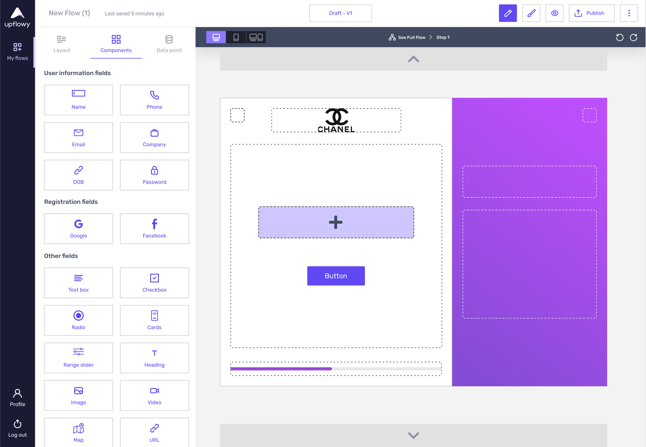
Grouped components into 3 categories:
- User Information
- Registration
- Others
2. Design system expansion
Upflowy’s design system was based on Ant design system. Overtime the app requires extra components with more specific details.
To address spacing concerns, it is needed to expand the existing design system to incorporate responsive spacing guidelines, define how spacing should adapt to various breakpoints. This expansion allowed for a systematic approach to maintaining consistency across different screen sizes.
It was important to foster collaboration between design and development teams during the expansion phase; ensure that designers and developers have a shared understanding of the updated spacing guidelines and how they should be implemented.
3. Prototyping & testing
Learnings
- Holistic design system approach
- Use of design tokens for responsiveness
A design system should be viewed holistically, with considerations for responsiveness integrated seamlessly into its principles.
Incorporating device-specific design tokens within the design system facilitates automatic adjustments, promoting a responsive user experience.