Reduce loads allocation time by 20%
Overview
Problem
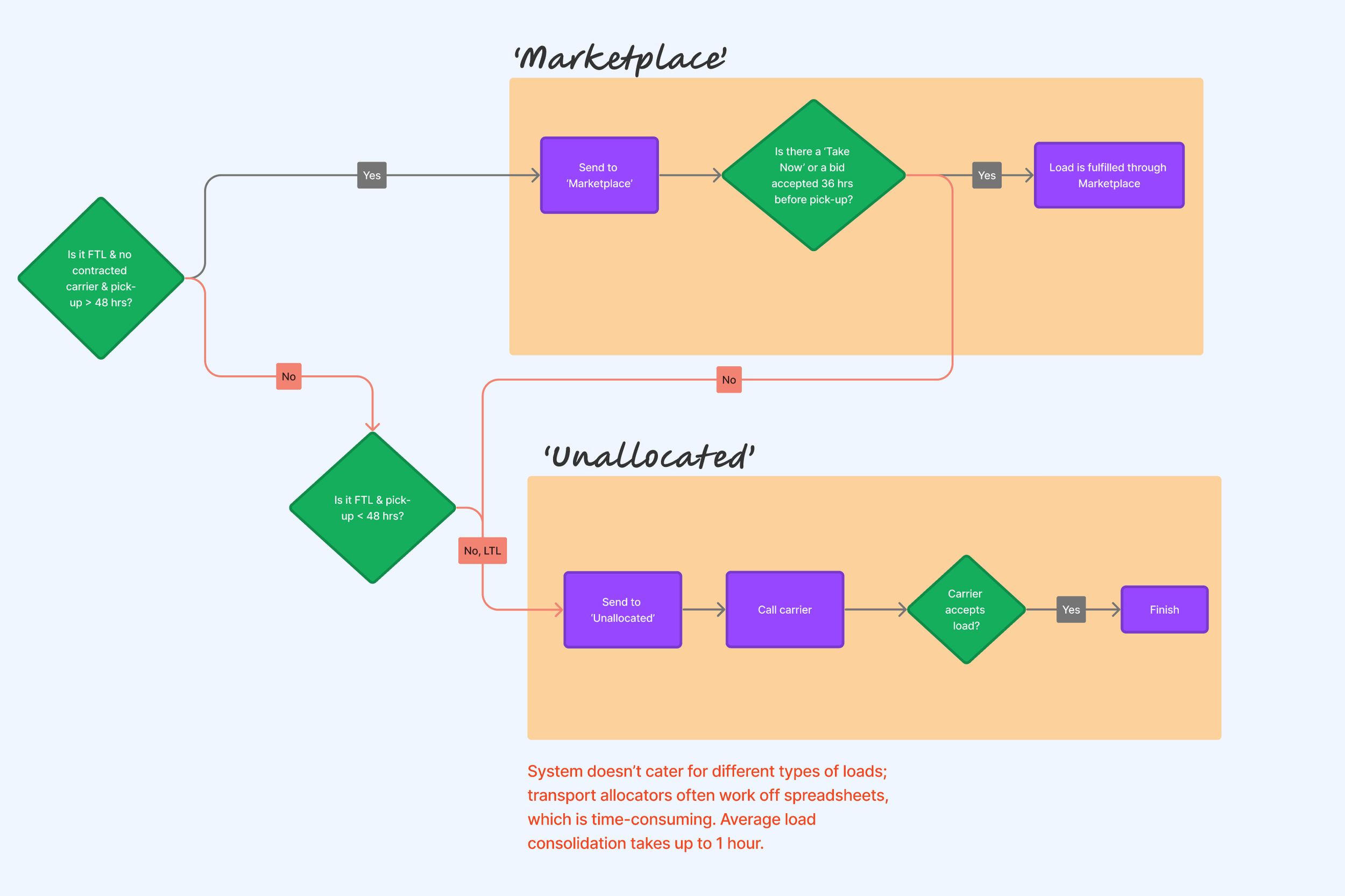
The operations team at Ofload faced significant challenges in efficiently matching carriers with available loads. The existing fulfillment flow was cumbersome, leading to delays in identifying suitable carriers. The key issues included difficulty in tracking frequent drivers, managing preferred carrier lists, and consolidating shipments. Additionally, the team struggled to co-load shipments from different shippers and lacked a system to flag carrier availability effectively.
Objectives
Increase efficiency in load matching:
- Enable loads consolidation
- Reduce the time it takes to match carriers with available loads.
- Enhance the accuracy of carrier-load assignments to ensure timely deliveries.
Outcome
The revamped fulfillment flow led to notable improvements in operational efficiency and carrier satisfaction. Key metrics included:
- Reduction loads consolidating time by 20%.
- Increase in carrier utilisation: Carrier utilisation improved by 30%, ensuring more consistent work for preferred carriers.
- Reduce the need for spreadsheet, all info and notes stored in the platform
My Role
I was the lead designer, collaborated with PM and developers.
My Process
Mapping current process flow
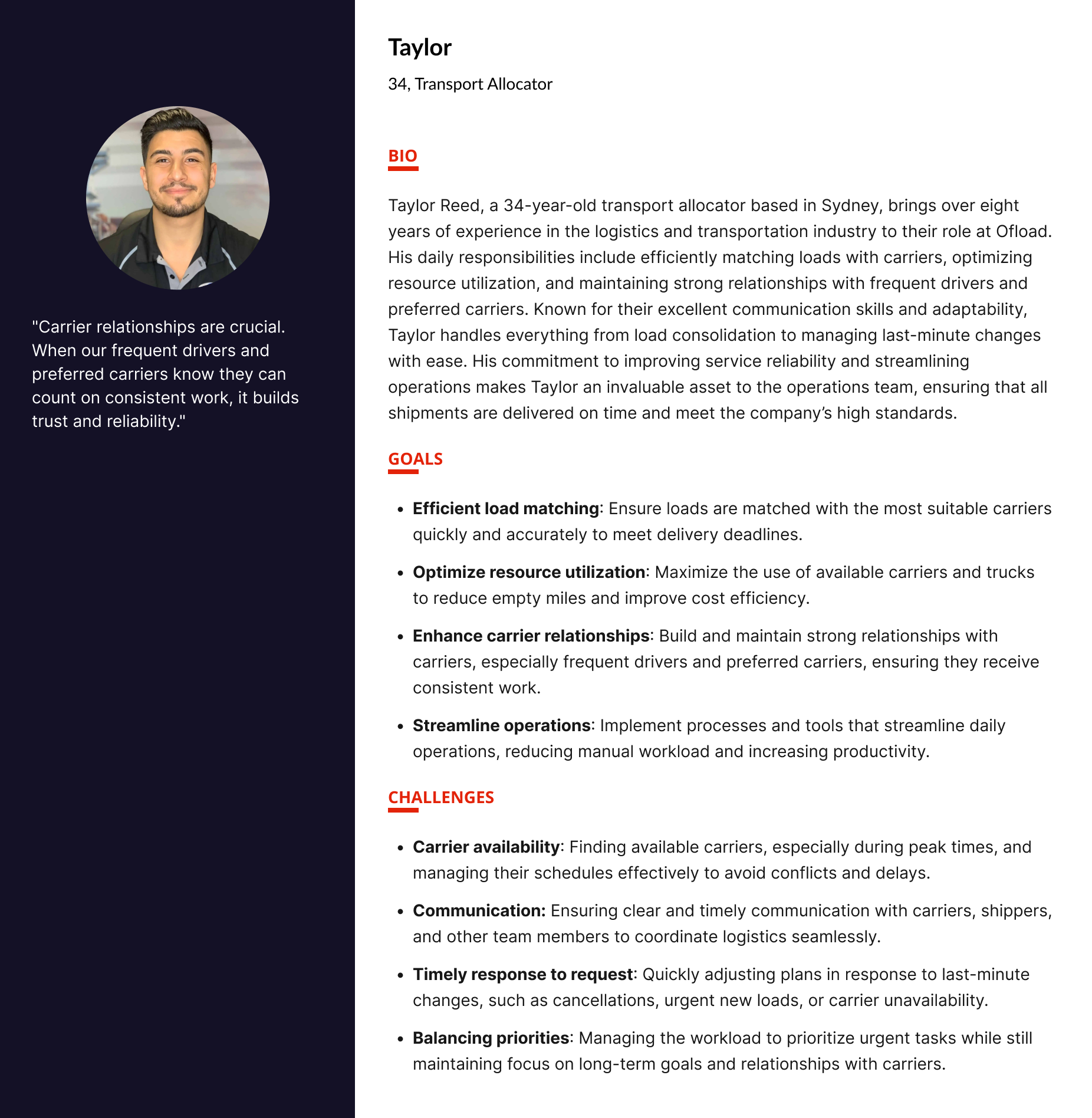
Understanding the needs of transport allocators
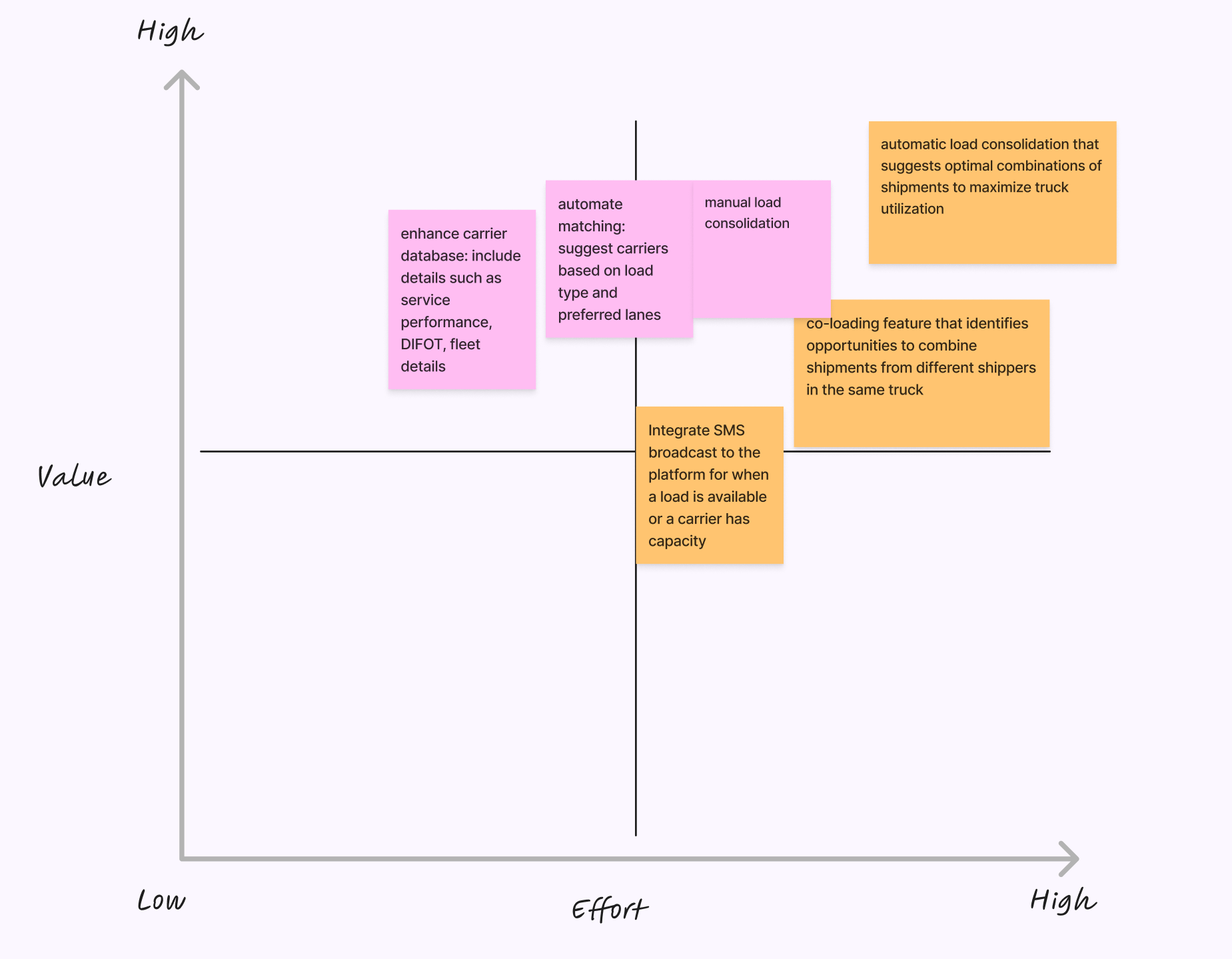
Define scope and feature prioritisation
I workshopped with stakeholders including PM, tech lead and managerial members of the operation team to align on the issues needed to be prioritised. “How might we” redesign the flow to help Taylor:
- Allocate loads efficiently: Tylor can easily view and update load details, reducing time spent on administrative tasks.
- User-friendly interface: A simple and intuitive interface ensures that Taylor can navigate the app effortlessly, saving time and reducing frustration.
Features that we will be focussing on:
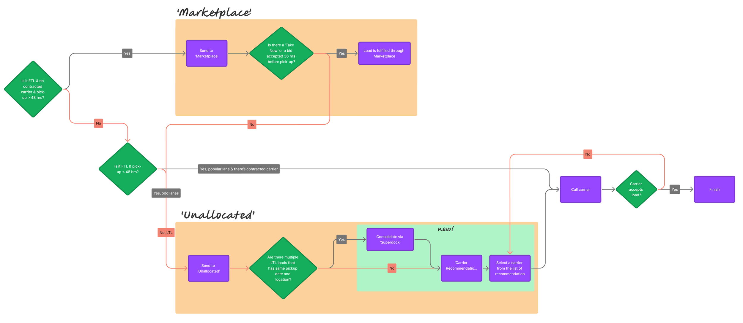
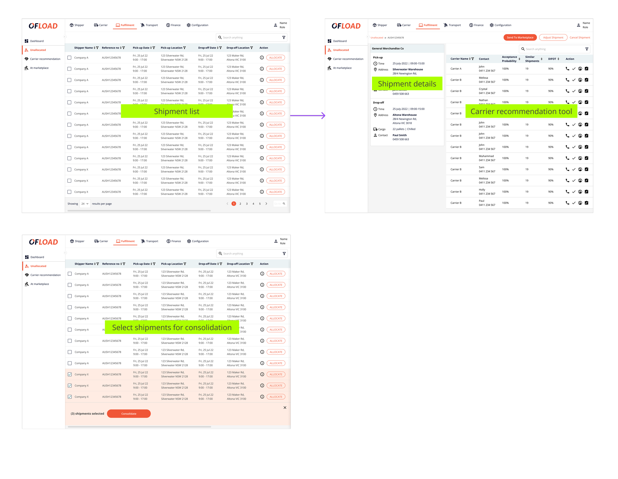
- Manual load consolidation
- Carrier recommendation tool
Mid-fi prototyping & clickable prototype walk-thru
Before the workshop with the PM and tech team to discuss solution details, I created various versions in Figma, including a new process map incorporating the proposed features..
Instead of usability testing, I did a waslk-thru of the new design with all transport allocators in the same room and get their initial feedback. Feedback from them:
"Consolidating orders is now so intuitive. I love the visual interface that shows potential combinations."
"The new matching algorithm for frequent drivers is a game-changer."
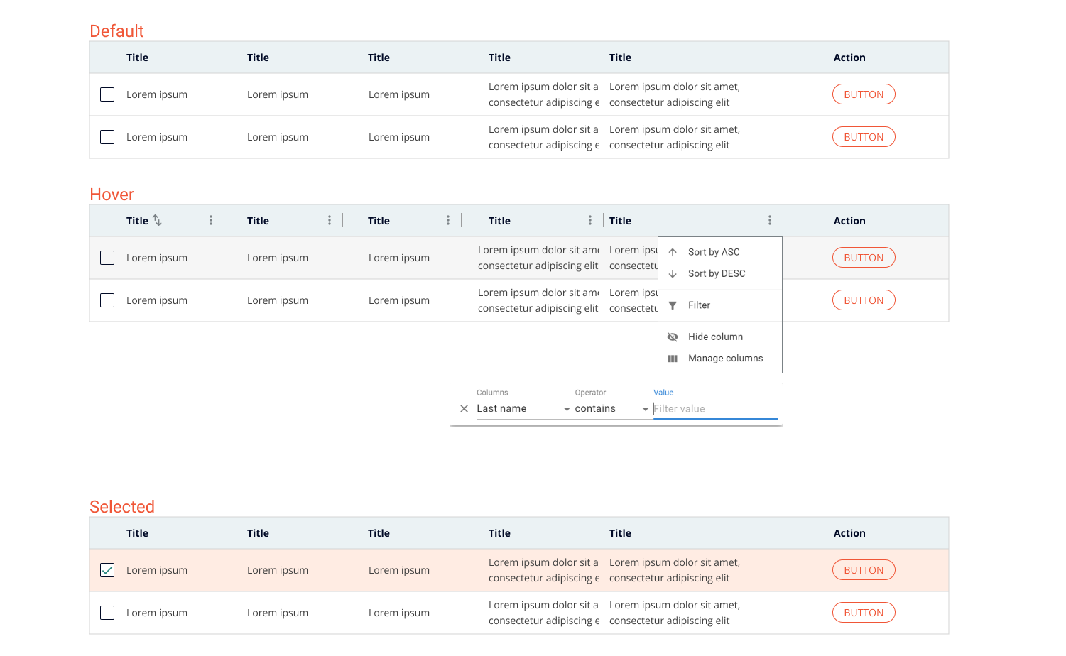
Design system
The design system was built based on MUI. MUI has an extensive set of pre-designed components allowed us to accelerate the development process, reducing the time needed to create common UI elements from scratch.
Optimise for desktop, focus on displaying information in the most efficient way.
Finalise the design and handoff
Learning
- Ship messy and iterate
- Collaborate across teams
- Design with pragmatism